The Bear Can Read Dashboard
Designing an interactive dashboard to allow parents to access and edit subscriptions that help their child learn with phonics reading books and activities.
The Bear Can Read helps your child learn with phonics reading books, activity sheets and more all in personalised bundles to support school phonics at home. Their customers enjoy the progressive system of reading bundles and the taylored approach to progressing their childs’ reading ability. The Bear Can Read wanted to improve their digital interface for their subscription platform, making managing and reviewing subscriptions easier as well as increasing user clarity.
How might we provde a frictionless navigational process?
How might we decrease users from contacting the support team?
How might we improve subscriber retention as well as encouraging referrals?
The pre-existing interface caused issues user experience, delivering a complex navigational system that made signposting unclear and led to an increased amount of users opting to contact support directly.
- Unclear heirachy of information
- Lack of signposting at higher levels
- Information not grouped
- User expection for informational structure is subverted
User Intent
The user, a proactive mother, wants to monitor and encourage her child’s’ reading and learning progression. Is more confident with identifying their child’s’ abilities and guiding their learning. They want a service that alleviates their need to understand and diagnose their childs’ abilities. They don’t feel as confident in teaching their child or understanding learning methods so relies on The Bear Can Read for educational support.


“I want to edit my subscription”


“I want to invite my friends to join”


“I want to review my childs’ reading level”
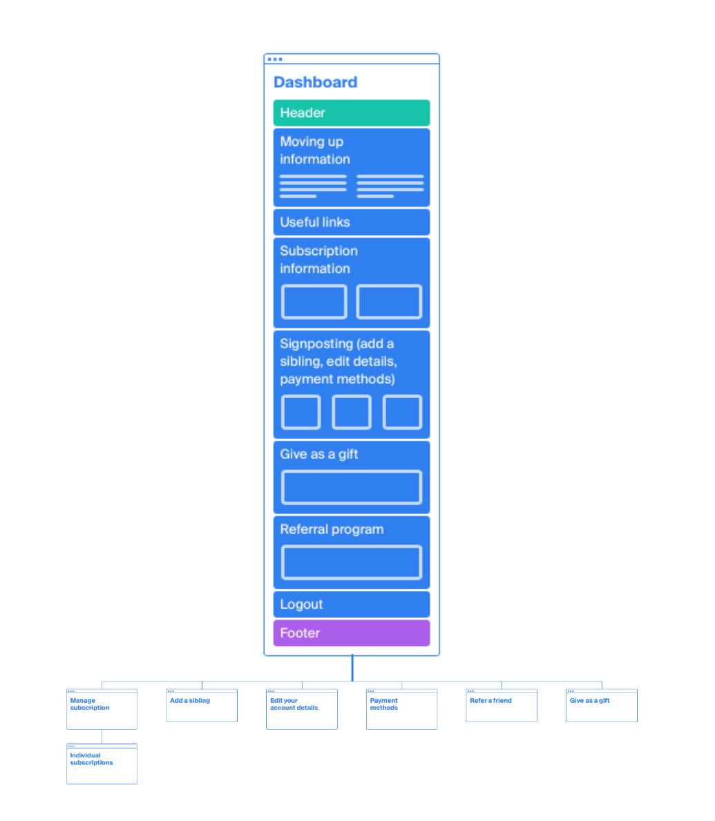

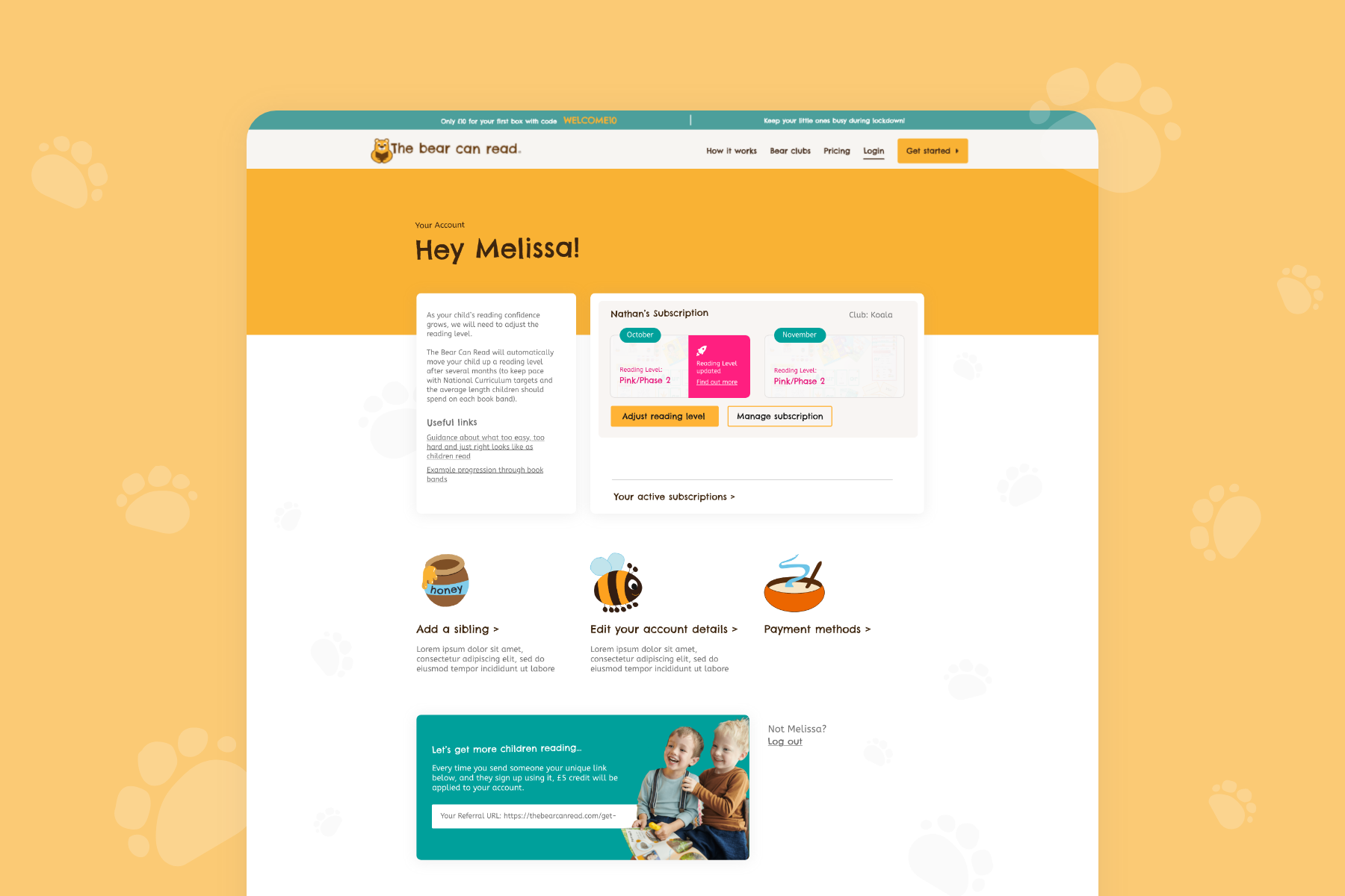
Site Structure and User Flows
The revised dashboard structure focuses on leveraging preexisting user expectations (Jakob’s Law) and restructuring information to work in the same way other sites they are familiar with do. The dashboard account area of the site needs to be extremely functional for the user so grouping information better allows for a consistent approach to user experience.
Wireframing
During the wireframing process we identified an information architecture and signposting strategy that focused on identifying user intent at the initial dashboard area. This simplified the users’ understanding of the interface and allowed them to explore areas with more clarity.

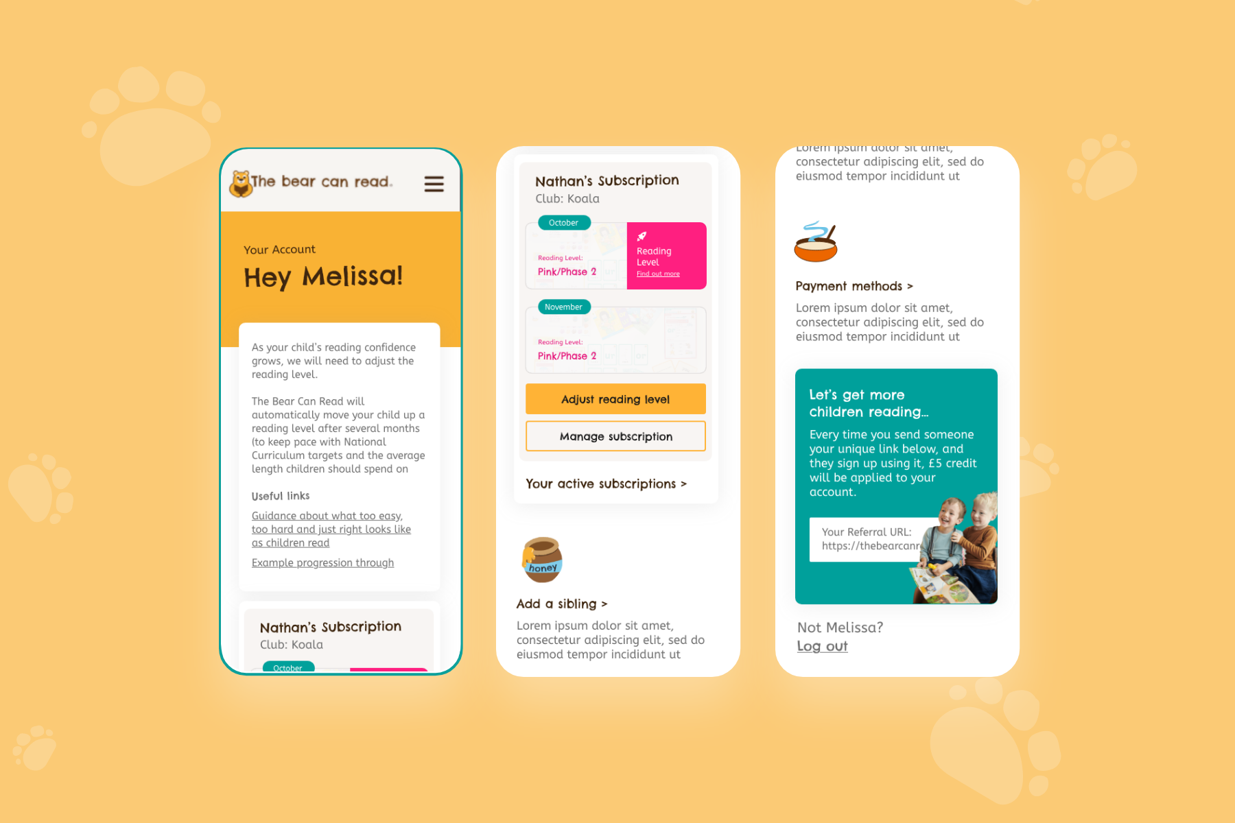
Main Dashboard once logged in.

Function to add a sibling to the subscription.

Search for child's school within database.

General account details information.


The Result:
✅ Increased customer retention
✅ Decreased user frustration
✅ Increased referrals
✅ Improved ease of use