Why Netflix’s interface works and Amazon Prime’s doesn’t
A dive into the experience and interfaces of online streaming platforms.


With lockdown demand for streaming services booming, more and more competitors are beginning to rise up to try to compete with some of the largest and longest standing paid platforms – Netflix, Amazon Prime and Now TV.
In this fight, three main factors count: cost, quality of shows, and experience. In the arena for experience, there’s one clear winner – Netflix, and one very clear loser – Amazon Prime.
Despite having subscriptions to both Netflix and Amazon Prime for quite some time, I always found myself utilising Netflix a lot more. Arguably, it could be because they often have better shows and movies, however having taken a look at their interfaces with more consideration, it seems to also be a lot to do with the user experience. Too often have I found frustration with not being able to find what I was looking for or being overwhelmed with information and instead skipped over to opening up Netflix. A series of navigational pain points, lack of intuitive design and offering the user too much non-relevant information seems to be the clear frustrations which hold Amazon Prime back from enticing and retaining user engagement.
Today, I plan to explore and understand where Amazon Prime falls down in comparison to it’s competitor, Netflix, as well as ways it can better improve it’s user experience.
“[Amazon Prime] is an unpolished heap of chaos with good content if you’re will to dig. Feels like rummaging through the junk drawer in your kitchen.”
– Reddit user on the user experience of Amazon Prime video streaming
Understanding the user
Netflix and Amazon Prime have very different users, with very different expectations. Whilst Netflix is solely a streaming platform, Amazon Prime has a broader user base of made up of shoppers who utilise Amazon Marketplace. Once signed up to Amazon Prime to get the benefits of free next day delivery, users get automatic access to the Amazon Prime streaming platform. According to Statista, Amazon Prime has near to 112 million paid subscribers in the US, whilst Netflix has a much smaller number, at 73 million paid subscribers. No doubt, this figure does not take into account that a large majority of Amazon’s users are not active Amazon Prime users and instead only signed up for the shopping perks.
However, this information does have a dramatic effect on the user expectations from the Amazon Prime streaming platform. Because it is a free benefit included in their subscription, users are typically not just signing up purely for the quality of the streaming platform so have lesser expectations of the quality of content and experience. Moreover, it also broadens the user base to people who typically wouldn’t utilise a paid platform – with a larger number of older users who watch traditional TV and unpaid streaming platforms such as BBC iPlayer and All 4. This user base is more familiar with typical consumption of content with it being less on demand or on platforms which are subsidised by ads, meaning their familiarity with poor user experience is already higher. Whereas Netflix’s users have a more purposeful level of intention behind signing up, and put more weight on the three key factors – cost, quality of content and experience – because it is solely a streaming platform. Their user base is also a younger and more narrow demographic, who have higher technical capabilities and exposure to online services.
Such factors contribute massively to Amazon Prime’s ability to retainer a much higher subscriber count whilst offering a lower quality of content and experience.
Finding a movie
Finding a movie or show to invest their time into watching is one of the primary pain points for users of both Netflix and Amazon Prime. This common occurrence is due to something called choice paralysis. Choice paralysis is when you have trouble making a decision because there’s an overwhelming amount of different options. Maybe you’ve experienced it while trying to order from a lengthy restaurant menu or while choosing a movie to watch.
Unfortunately, choice paralysis contradicts another core user need – browsing. The user wants to be able to quickly and easily browse options in order to find a movie or show which grabs their attention visually, often based on what tone the movie feels like it sets, wether they recognise it or if they like the actors in it. In both platforms, Netflix and Amazon Prime, you can observe the attempt to balance choice paralysis and browsing needs.
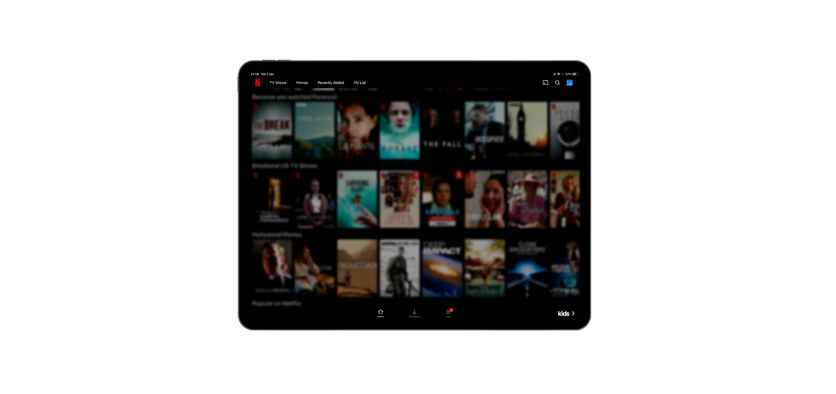
In Netflix, the large prominent feature film at the top sets a tone and an atmosphere, giving a similar experience to seeing trailers before a movie at the cinema. This is then followed by a list of ‘Recently Added’ which just about peaks into the top frame, urging scroll down. In this top frame, there is clear focus and prominence put on the featured content prior to going in to the lower interface which is populated by 8 featured images per row.
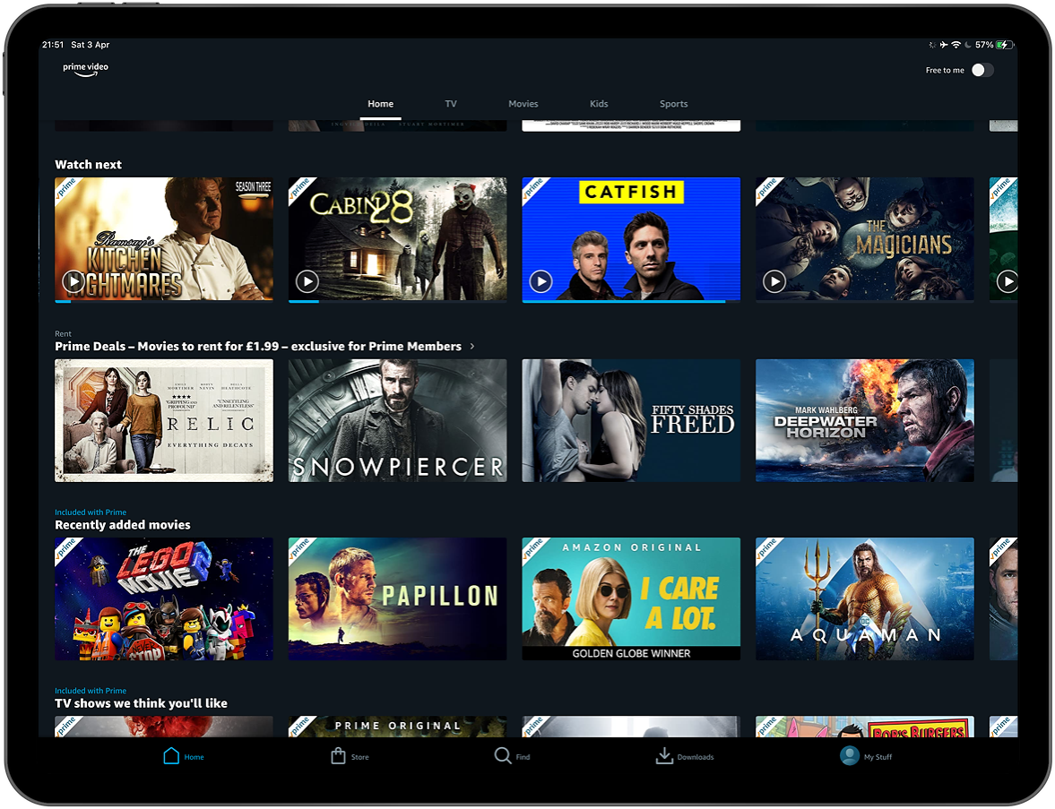
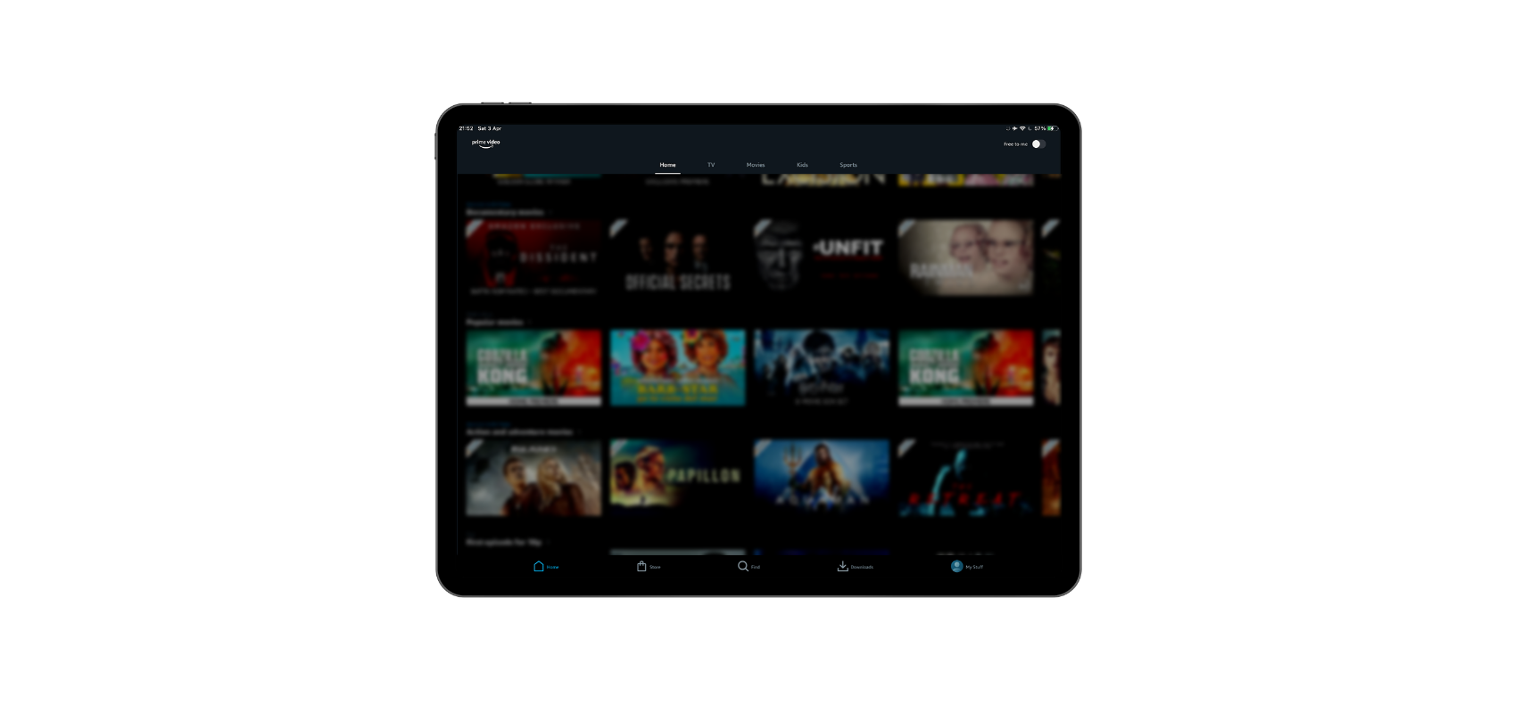
Amazon Prime also features new releases and focused content, however the impact of this is a lot less so than that of Netflix. The much smaller reduced featured area and use of a carousel feels somewhat negated and overlooked, considering that the rest of the page is made up of carousels. Unlike Netflix, this mode of featuring doesn’t allow for any additional context, description or ability to add to list. This seems like a missed opportunity to really promote Amazon Originals and build excitement around them. Instead, the reduced height featured area pushed further rows up the page and results in what feels like a cluttered and unintuitive top frame that doesn’t feel like the content is updated as regularly as Netflix’s due to the stagnation of style.
The further focus on the section immediately after the featured carousel seems to serve the business needs and not the user’s, listing Amazon Originals above ‘Movies we think you’ll like’. Amazon Originals aren’t renowned as the best quality of content, or that regular in release, so the prominence in the hierarchy clearly contradicts user preferences. Moreover, it is a telling sign within the lack of thought gone into the structure of the top frame that often the same movie title is shown multiple times within the top two rows upon load. This causes a waste of visual space and additional clutter to the interface.

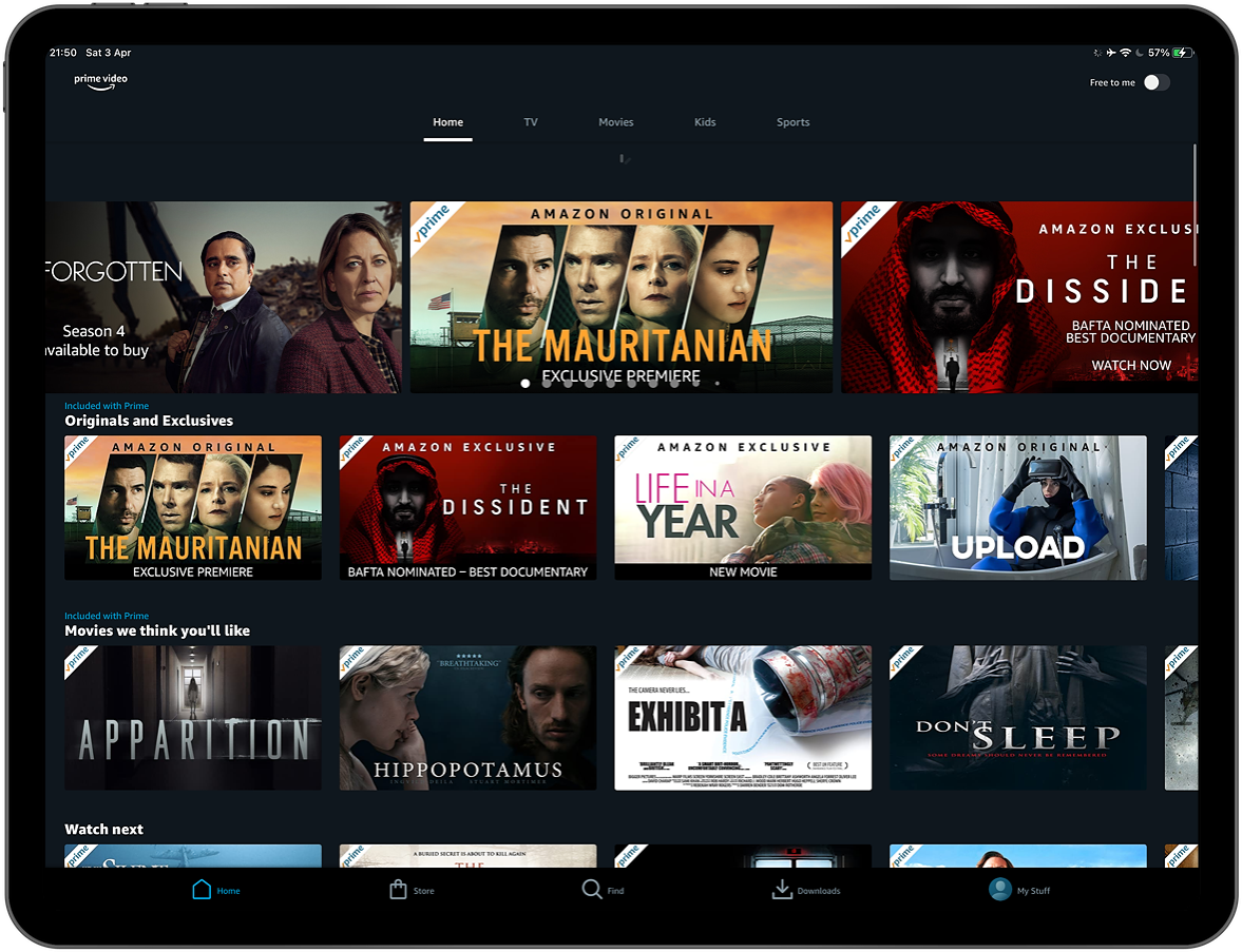
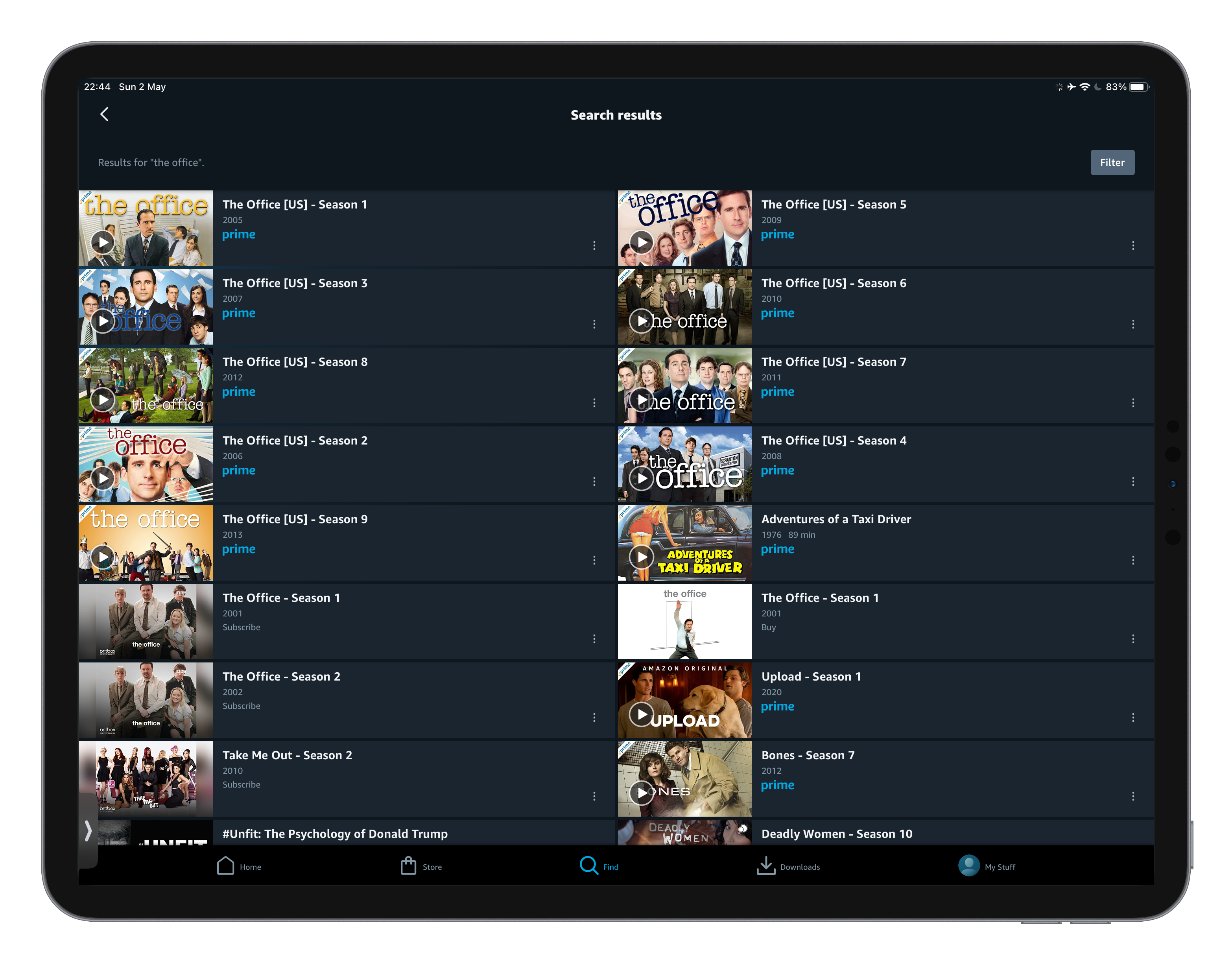
To further assess the browsing areas of each platforms used by Amazon Prime, the horizontal format of cards seem to cause additional visual issues. Despite listing 8 movies per row, as opposed to Prime’s 5, Netflix uses a simple portrait card format which minimises the creative opportunity of the cards. Because content titles aren’t displayed underneath the cards on either platforms, standardised formatting of text within cards is highly important to ensure the user can quickly recognise and consume information.
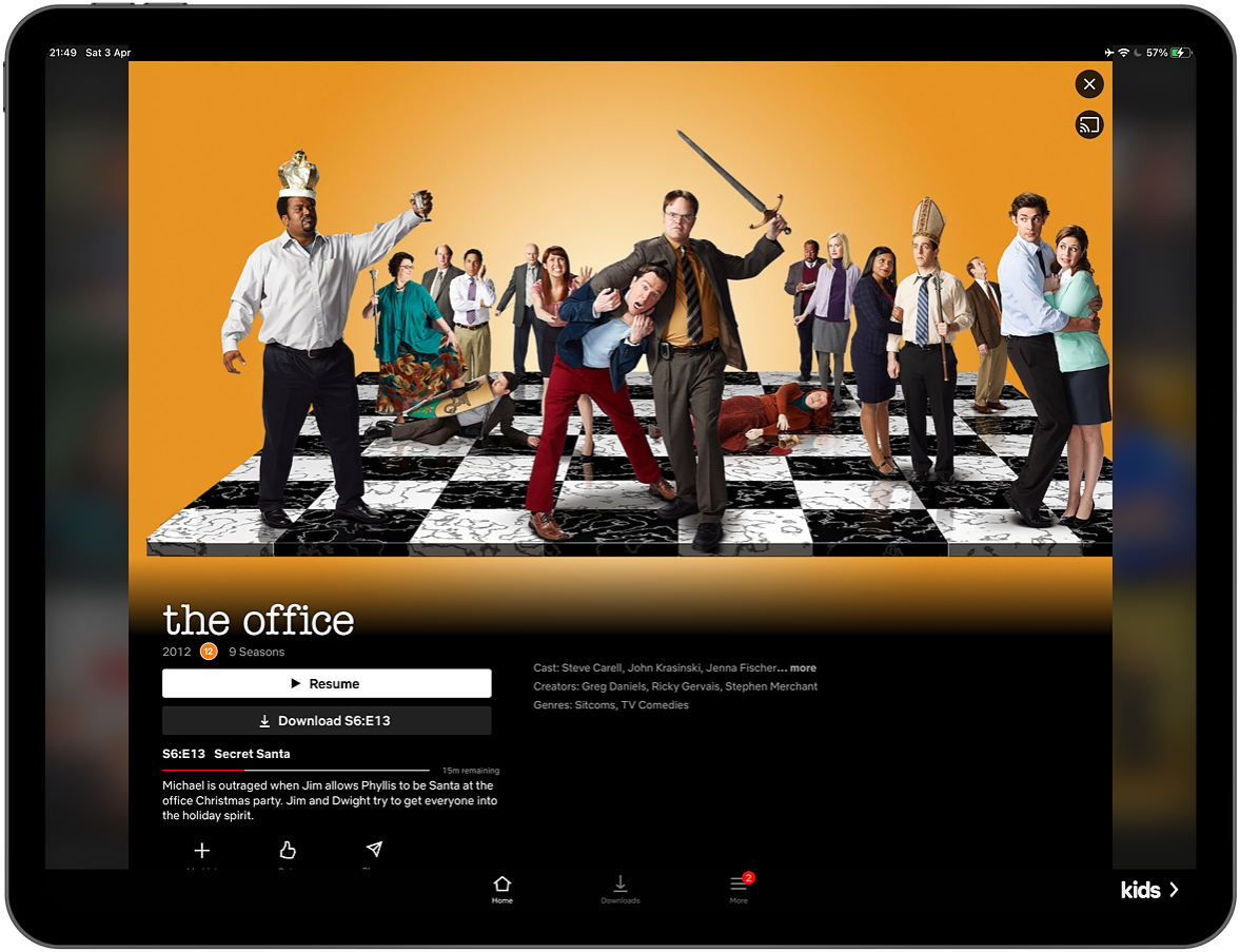
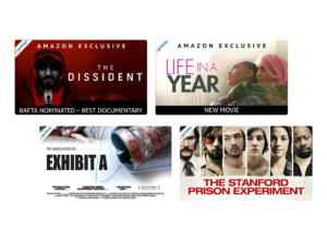
In this way, Amazon Prime is a bit unwieldy. The below image shows a snapshot of 4 cards which came up on my homepage. The eye jumps around the cards looking for the title, with inconsistent focal points for images and text. Further visual noise is caused by the intrusive need for ‘prime’ labelling to denote if a listing is included as part of the free package. Positioned on the left of cards, this interrupts the natural flow of reading, is repetitive and intrusive. Moreover, additional text overlays of ‘Amazon Exclusive’ and award accolades muddy the card graphics.
The section titles used within Amazon Prime’s interface add further complexity to the user experience. Section titles such as ‘Movies we think you’ll like’ and ‘Watch next’ have clunky wording and allude to why these options are being shown to me. Contrast this with Netflix’s ‘Because you watched..’, ‘Watch it again’ and ‘My list’, and it is clear how effective well considered UX micro copy can be in helping users make decisions.

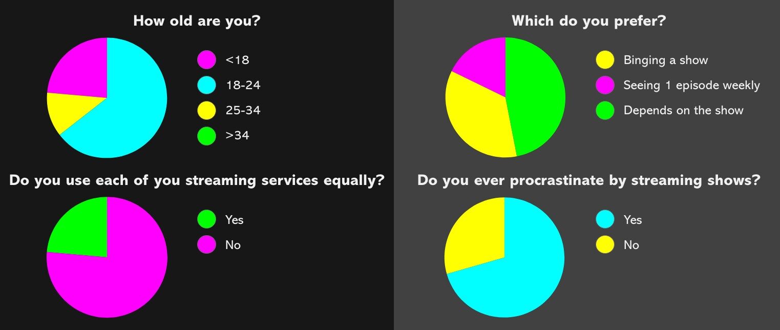
77% of users have a hard time choosing a movie.
Netflix discovery experience — a UX/UI case study, Faraz Ali, 2018

To further assess the browsing areas of each platforms used by Amazon Prime, the horizontal format of cards seem to cause additional visual issues. Despite listing 8 movies per row, as opposed to Prime’s 5, Netflix uses a simple portrait card format which minimises the creative opportunity of the cards. Because content titles aren’t displayed underneath the cards on either platforms, standardised formatting of text within cards is highly important to ensure the user can quickly recognise and consume information.
It is also interesting to note that Netlix’s use of data selected graphics may also help in minimising the ‘visual clutter’. Amazon does not use any data to understand which graphics they should display on preview cards, meaning they are often compelled to show movie-poster-esc approaches which typically focus on showing as many high fame cast members as possible. In contrast to this, Netflix has a more creative and intuitive use of preview cards. With user behaviour data to determine the types of genres that compel specific users, they focus instead on generating hand-picked graphics from pre-identified options which focus on setting a mood or metaphor for the story. This helps simplify the preview cards and craft digestible ‘feelings’ through well considered semantics that the user can use to make their viewing decision more successfully.
Navigation
The navigation of a video streaming platform plays prominently into the user’s ability to find the content they are looking for, search for specific content, or change account details. Indeed, because users have such frequent and repetitive use of the internet, their familiarity with typical UX practices helps shape their experience and understanding of how to navigate other sires. This principle, know as Jakob’s Law allows us to critically assess a navigational structure, based on a user’s typical expectations of how they would utilise this during their journey.
There are several areas within the navigation where Netflix once again precedes Amazon Prime in user experience and UI heuristics. Firstly, Netflix has minimised the amount of options and clickable links in both the top and bottom navigations in order to simplify and refine user routes. Amazon Prime, on the other hand, have a dual ‘home’ on both the top and bottom navigation which confuse the user expectation, as well as the additional ‘free to me’ toggle. It is worth baring in mind the placement of functional elements and links; whereas Netflix capitalises on the understanding that the right of the screen is more innate to the user on tablet and mobile, by placing the search top right, Amazon Prime places this bottom centre. This placement is confusing to me as a user. Although this is not an e-commerce or content led site, the principles of Jakob’s law create a compelling argument that search functionality is best placed top right as the user reads from left top right, top to bottom. This means they will read the categories then across to the search. Amazon Prime’s placement pushes the hierarchy of search way down the pecking order as the user first has to consume the top line of option, all of the visuals of the centre screen and then find the search half way through the bottom navigation. This seems clunky and certainly not where a user would innately look to in order to find the search.
In considering the heuristics of the links and functionality in the navigation, Amazon Prime over-explains the meanings of links. This fails to consider the user’s familiarity with the meanings of icons, having to denote that a magnifying glass means ‘search’.
Visually, Netflix’s navigation is a lot sleeker; simplified down to just top level information and utilising grouping principles to aid information flow and content digestion. In comparison, Amazon Prime appears cluttered and sprawling.
Personalisation and user behaviour
As of July 2018, Netflix has 130 million worldwide streaming subscribers. Having this large user base allows Netflix to gather a tremendous amount of data. With this data, Netflix can make better decisions both on improving their interface and in providing relevant movies and shows based on learned behaviours. This is something that is noticeable when you access Netflix, in every element it is moulded to it’s understanding of you and producing relevant recommendations. Utilising this power is clever – as it gives online streaming the competitive edge. Traditional television networks don’t have these kinds of privileges in their broadcasting, with little other than rating approximations and no ability to learn more about watchers. Here’s a look at some of the “events” Netflix tracks: “-When you pause, rewind, or fast forward – Completion rate – What day you watch content (Netflix has found people watch TV shows during the week and movies during the weekend.) – The date you watch – What time you watch content – Where you watch (zip code) – What device you use to watch (Do you like to use your tablet for TV shows and your Roku for movies? – Do people access the Just for Kids feature more on their iPads, etc.?) When you pause and leave content (and if you ever come back) – The ratings given (about 4 million per day) – Searches (about 3 million per day) – Browsing and scrolling behavior” – Neil Patel, How Netflix Uses Analytics Learnings from “events” allows Netflix to stand out as a platform which enriches you through niching down to your interests, rather than the mindless watching and catch-all user base of a lot of TV channels. However, although Amazon Prime has the same data available it doesn’t use it to the same advantage. It’s tracking of “events” appears less sophisticated by regularly suggesting based on genre, rather than based on factors around time of day, behaviours, or completion. You could start a horror movie at 11.30 at night, exit half way through and find you are being recommended similar content mid day on a Sunday. The lack of data usage results in poor quality of curation for recommended watches, increasing user frustration drastically.
75% of users want a more personalised interface.
Netflix discovery experience — a UX/UI case study, Faraz Ali, 2018
Search options and results
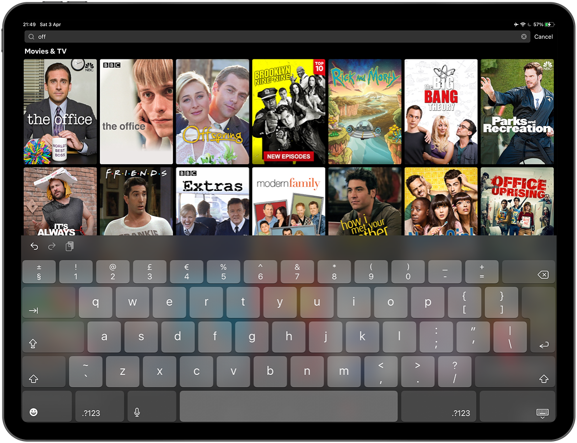
Netflix has made searching easy. It’s available within 1 click anywhere within the dashboard of the platform prior to clicking into a video, an easy access point for users browsing. After you click on the search box it expands in size, providing hints and live results based on a complex algorithm of your habits, global popularity, related results and many other factors. Within one click, you can search and find what you’re looking for. The grid layout with poster thumbnails provides easy recognition of familiar movies and shows.
In short, Netflix has really identified user behaviour and innovated functionality that goes beyond the minimum expectations of the user, instead leaning into the service they provide.Almost acting as a friend who recommends shows to you based on a conversation you’re having.
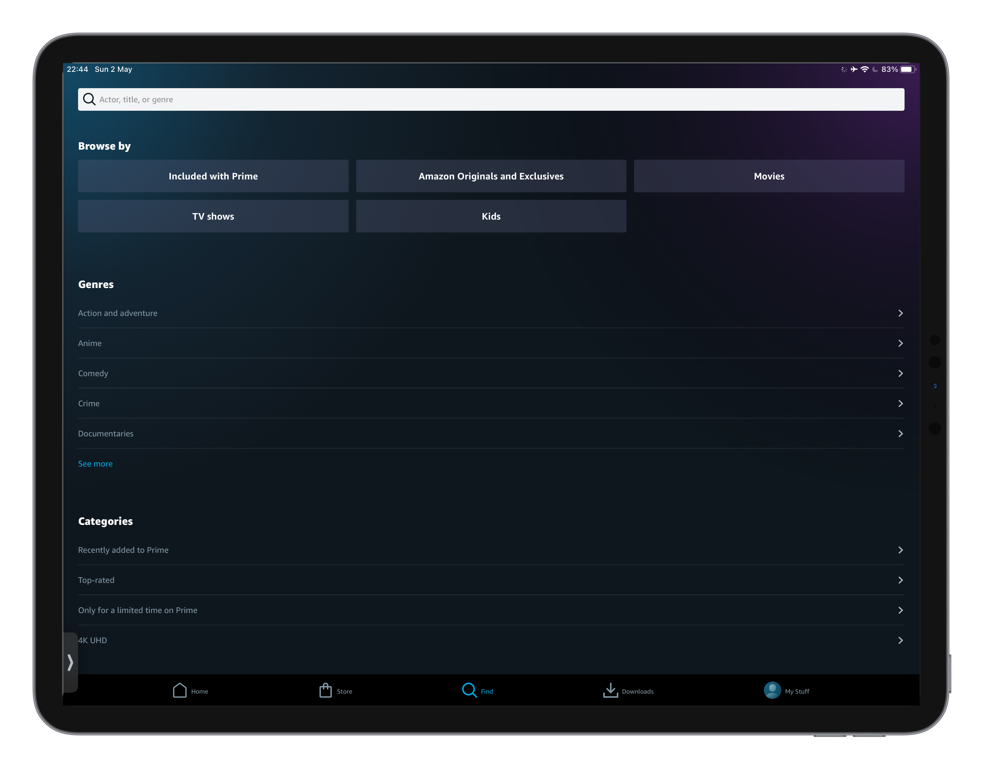
Amazon Prime, however takes a more static approach. It relies on the user already knowing somewhat what they want to watch, or at least what type of movie or show they’d like to explore. This often isn’t the case for the user, who needs suggestions and visual stimuli in order to make decisions on genre or type of media. Initially their search appears more as a navigational system than a search, with categories and sub categories listed as drop down menus. The user, having already clicked once to get onto this screen then has to click again to begin typing, then again to complete the search. This, compatible to Netflix’s one click search is certainly less intuitive to how the users of streaming platforms consume and browse. Further hinderance is the search functionality itself which has less capabilities for live results and is fairly dated in suggestion criteria. As seen below, live results are shown as a text preview that instead of taking the user through to the show or movie, then takes them to results for that criteria.
These issues result in it being a lot less easy to stumble upon a movie or show you might like, whilst searching for another. This is a shame as it takes away the human side of the entertainment industry and on how movies and shows are recommended to us in person or whilst browsing Blockbuster.
Amazon Prime’s separation of seasons and skews make it’s search results even more so complex. The user is prompted to make a decision upfront of which season they would like to watch, rather than first understanding the nature of the show. This may be partially beneficial to user in allowing them to understand quicker wether the streaming platform offers a particular season of a show, however considering that increasingly streaming platforms purchase the rights to air full seasons this seems slightly redundant.
It’s also worth noting the change in card styling in this screen, which has a notable change from the home area to include more context and information. This aids the separation of seasons by providing clear descriptions, however feels dated in styling and format. Information such as the ‘prime tick’ is repeated across the preview card and the description area, a play button overlapping the preview card and blur area where the format of preview images don’t fit the correct ratio. These elements contribute to the feeling that this interface is ‘clunky’.
“It’s a little cluttered—not terrible but not very clean either.”—Prime Video user
Video control section
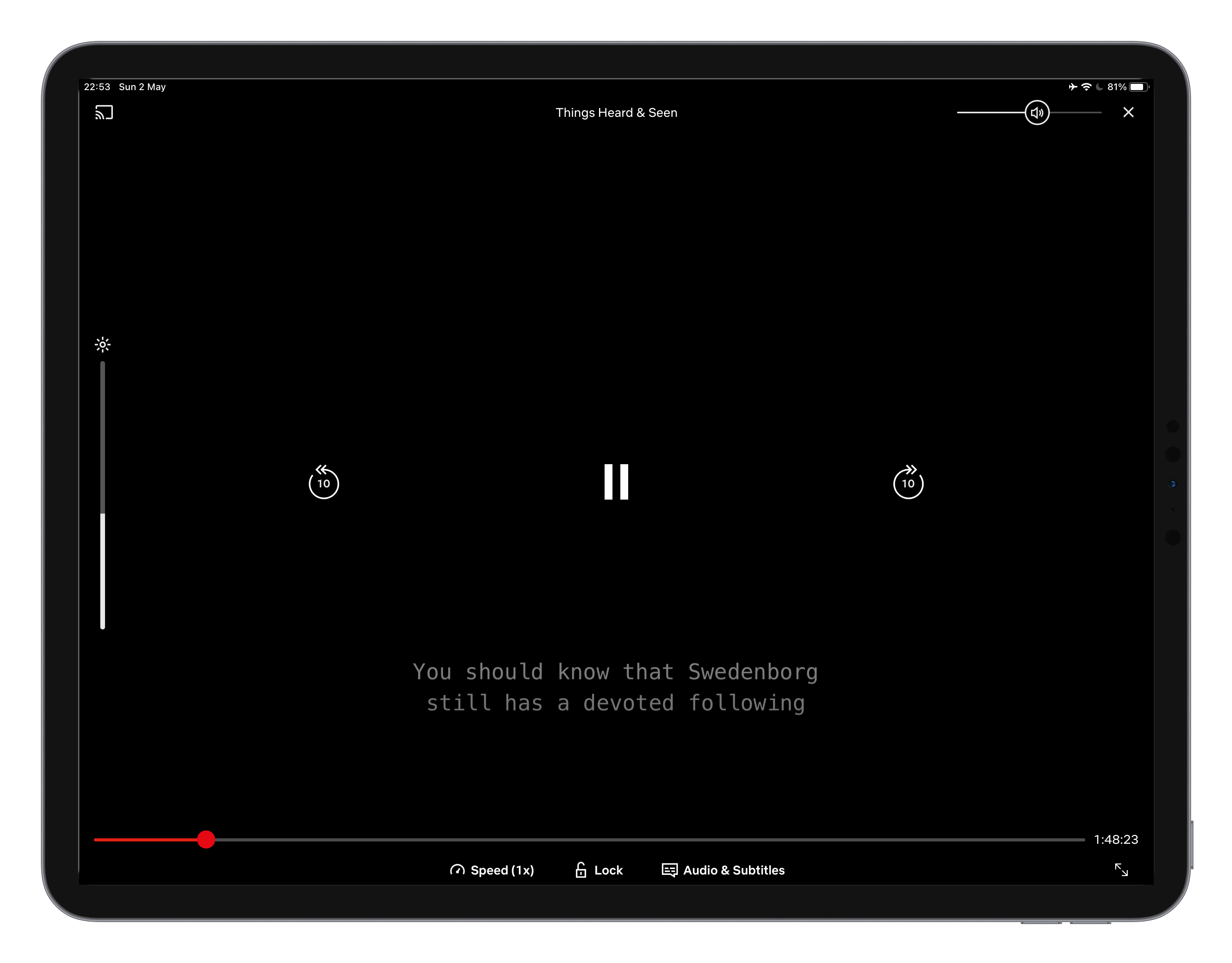
Control options within videos is a lot more comparable between Netflix and Amazon Prime. We see this through placement of options and functionality when comparing mobile usage. However, tablet and desktop are still varied with how these are laid out and what’s on offer. Whilst Netlfix’s placement once again seems to consider user touchpoint and familiarity with other platforms such as Youtube.
In Amazon Prime videos, except for the pause, play and forward and backward options (which remain in the middle) all the other options remain on the top-right corner of the screen. On Netflix you can find all the video control and other options on the bottom of the screen, which on mobile and tablet are beneficial to the key touch areas. Amazon Prime pushes these up to the top right hand corner, which although simplifying the bottom controls, puts them out of reach.
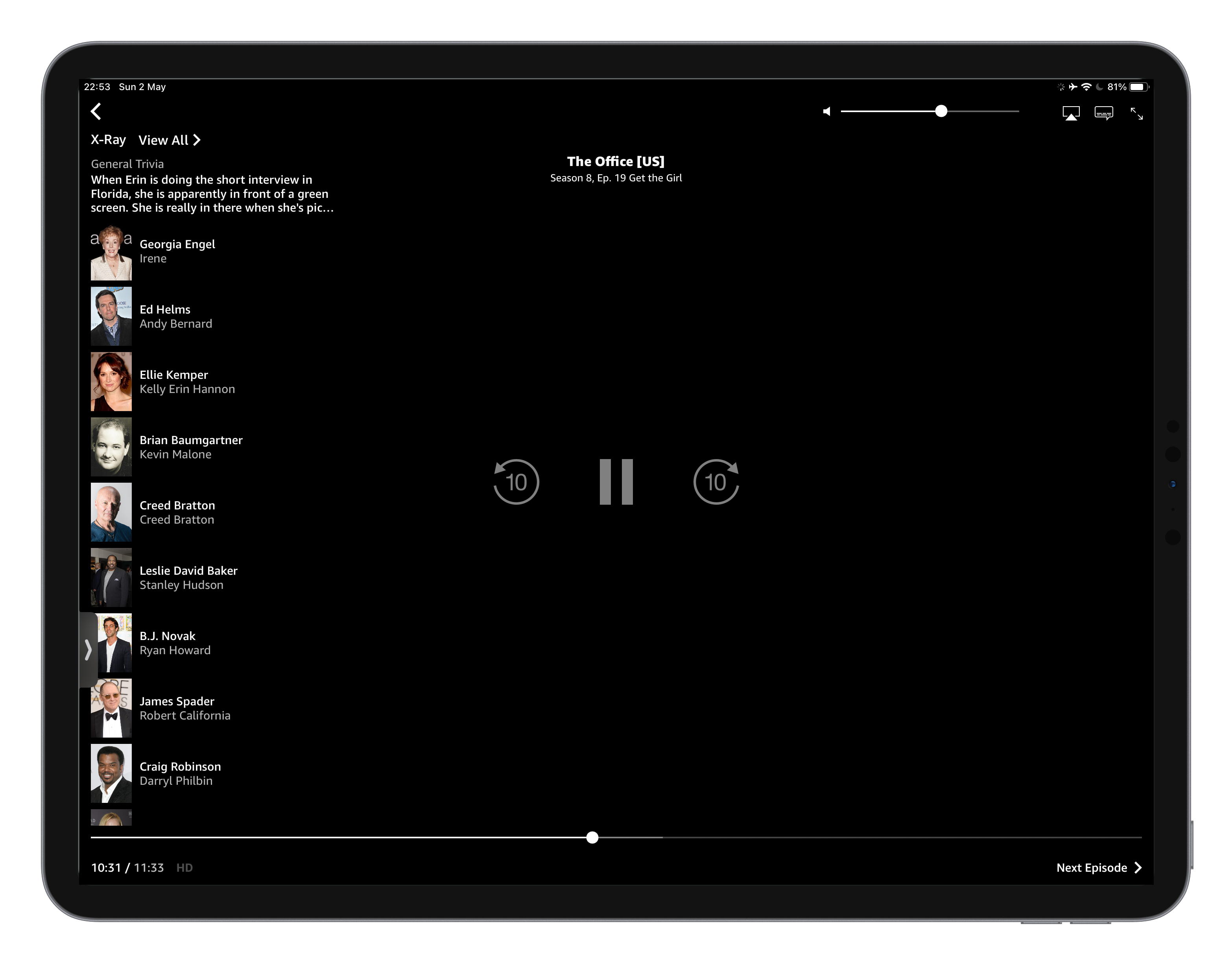
Amazon Prime does offer an interesting feature when paused which shows the actors in that scene. With many mid-show conversations being users debating where they know an actor from, this in app functionality adds context in a clever and accessible area. Netflix evades this functionality, however instead make it easier to browse more of a season episodes by introducing a browse in screen option. This allows users to be reminded of how many episodes they have left of a season and jump ahead or back by several episodes at a time without even leaving the video viewer.
Conclusion
It’s challenging to call any mass-market consumer UX “poor”. Compromises to user experience often have to be made to accommodate for varying user needs, which especially in that of Amazon Prime is added to in the additional business needs. Amazon’s need to accommodate for marketplace subscribers and the focus on upselling ‘buy or rent’ options as opposed to entirely free, requires more complex user journeys and possibilities. Indeed, the sub-par user interface and experience of Prime (when compared to its rival Netflix) may simply be explained by its use as a marketing tool, rather than a core business proposition. It’s use as an upsell to get Amazon Marketplace users to sign up to the paid Prime offering, creates opportunity for subscription growth where the video streaming platform is simply positioned as a free benefit. From this, it’s clear that Amazon Prime’s streaming platform has key performance indicators that revolve around increase in subscription numbers. Netflix’s revenue however is entirely dependant on it’s reputation as a video streaming platform and for providing ease of use to on-demand audiences, if users aren’t finding the content they want they will simply unsubscribe as there is no other benefits to the platform. This puts a focus on time spent watching as a key performance indicator.
Finally, it’s important to remember that systems are designed to be used by many people often have a wide variety of scenarios and personas to cope with and there are always going to be instances where some user experience traits work better for some users than others. Although Netflix’s interface is superior for a user with habits similar to my own, Amazon Prime has a clearly defined interface which is well suited to upselling and infrequent use.